I design fintech apps, white-label banking and the internal portals that keep operations running. Since 2024 at TPS Worldwide; making graphics and motion since 2017.
I start with how the work really flows, then build the screens on top, so the product still holds up when real people and real data arrive.
Where I’ve worked
TPS WorldwideJun 2024 – nowUI/UX Designer
FreelanceJan 2017 – nowGraphic, motion and UI/UX
CN InternationalsApr 2023 – Jun 2024Email Coordinator (remote)
Tools
FigmaAfter EffectsIllustratorPhotoshop
Claude and ChatGPT for research, writing and coded prototypes; Gemini, Midjourney and Ideogram for visual exploration. Figma stays where the design gets decided.
Side project
Sabr: A namaz companion that never judges
Tracks the five daily prayers and the missed (qaza) ones, with gentle reminders. Designed in Claude Design, now being built in Flutter.
A multi-bank wallet: link your bank accounts once, then pay, top up and transfer from one app.
Role
Sole product designer, TPS Worldwide
Platform
Mobile app
Status
In development
Client
Confidential
The brief
The brief was one line: build a multi-bank wallet. People link several bank accounts in one app, then pay, top up and transfer from there. I designed the whole app in Figma, from scratch, working alongside the mobile developer who is building it.
Key decisions
Each decision, next to the screens it shaped.
01
Each bank in its own colours
The problem
One app holds accounts from several banks, and each bank has its own brand.
The decision
Swipe between linked account cards and the home screen takes on that bank’s colours, following each bank’s brand guidelines.
02
One card: virtual first, physical on request
The problem
People want to pay straight away, and some also want a card in their pocket.
The decision
The app gives you a virtual card at once. Request a physical card and the same card becomes physical. Top up from any linked bank and send money back to it.
03
Identify with BBAN or CIF, confirm with OTP
The problem
Linking a bank account has to be both easy and certain.
The decision
BBAN and CIF are each bank’s unique identifiers for an account; a one-time password confirms the link.
04
Security in layers
The problem
A wallet holds the keys to several bank accounts at once.
The decision
PIN or Face ID before My QR and notifications, a transaction PIN for transfers, and a one-time password for linking banks and activating the card.
Key screens
Home
Link a bank
Confirm with OTP
Transfer
Receipt
Physical card
Set PIN
Card controls
What I designed
Bank linkingHome and account cardsVirtual-to-physical cardTop-up and transfersSpending and ATM limitsReceiptsCard activation and PIN
Designed end to end in Figma. Banks, people and amounts on these screens are fictional.
One platform that runs a school and college, from the owner’s desk to the classroom.
Role
Discovery, product definition, concept design
Platform
Web portal + mobile apps
Status
Product brief done, concept screens
Tools
Claude, Claude Design
The brief
The owner of The Pace School & College in Karachi wanted one place to run everything, from classrooms to money. I visited the college, worked through the product with him, and turned our conversations into a full product brief covering every role, workflow and screen. Then I designed the concept screens, with Claude helping me research, draft and generate.
Key decisions
Each decision is marked on the real screens. The numbers on a screen match the notes beside it.
01
Built for one college, ready for many
The problem
A system made only for PACE would have to be rebuilt for the next school.
The decision
Atlas is the platform and PACE is a tenant on it. The school’s crest appears in a few identity spots, while Atlas’s colours keep the same meaning for every school.
123
4
On the screen
1Atlas: the platform
2PACE: the school using it
3Status colours stay the same for every school
4The school’s crest on its fee vouchers
02
Every number says how fresh it is
The problem
An owner can’t act on a number if he doesn’t know whether it came in this minute or from a paper register this morning.
The decision
Every figure carries a small badge: Live, synced a few minutes ago, or Manual.
123
On the screen
1Live: straight from gates and devices
2Synced: a few minutes old
3Manual: keyed in from a paper register
03
Same process on any equipment
The problem
One campus has smart gates, another has only teachers’ phones, a third still uses paper.
The decision
Each campus is set up with the equipment it really has, and every feature falls back step by step: gate scanners, then the teacher’s app, then the paper register.
123
4
On the screen
1Smart campus: gate scanners fill the register
2Connected campus: roll call on the teacher’s phone
3Essential campus: paper register, keyed in
4Config Studio: a campus’s equipment sets each fallback
04
Money needs two people
The problem
Fee vouchers, concessions and fee rises move real money. One person should never be able to send them alone.
The decision
Every money action has a maker and a checker, and there is no direct send. Big decisions collect sign-offs before they reach the owner.
123
45
On the screen
1The maker prepares the vouchers
2A checker approves them
3No direct send: approval comes first
4Two sign-offs before the owner sees it
5Above the limit, Approve is blocked
05
Works offline, speaks Urdu
The problem
Teachers work on weak 4G, and many parents read Urdu first.
The decision
Teacher apps save everything on the phone and say exactly what hasn’t synced. The parent app has a full right-to-left Urdu home.
123
45
On the screen
1Offline? Marks stay saved on the phone
2It says exactly what hasn’t synced
3Bad data can’t sync: fix it first
4An Urdu-first greeting
5Right-to-left navigation, Home on the right
Key screens
Network pulse
Roll call
Live campus
Family home in Urdu
Voucher run
Marks, offline
Config studio
What I designed
On-site discoveryProduct briefRoles and workflowsScreen inventory25 concept screensUrdu, right-to-left
Discovery in person at the college; brief and concept screens made with Claude and Claude Design. Figures on the screens are sample data.
A digital-dollar wallet that carries freelancers’ crypto earnings home to their own bank.
Role
Concept, research and product design
Platform
Mobile app + web dashboard
Status
Self-initiated concept
Tools
Paper, Claude Design
The brief
Freelancers in Pakistan are often paid by clients abroad in digital dollars (USDC). Turning that into rupees usually means selling to strangers peer-to-peer, at rates that move, with the risk of a frozen bank account. Ferry holds the dollars and carries them home: one tap to your own bank, at a rate you see first. I started from a paper sketch, checked how it could work under Pakistan’s new 2026 crypto rules, and designed 21 mobile and 9 web screens in light and dark.
Key decisions
Each decision, next to the screens it shaped.
01
One wallet, every destination
The problem
Freelancers juggle a bank, an e-wallet and a card, and the crypto they’re paid in lives somewhere else entirely.
The decision
One balance in digital dollars on top, and every account in your name stacked underneath as a place the money can go. It started as a sketch on paper.
123
On the screen
1One balance, in dollars, with the rupee value under it
2The front card is the default cash-out account; no fake balances
3An outside crypto wallet is a source, kept apart
02
No strangers in the middle
The problem
Today most freelancers sell crypto peer-to-peer. The rupees come from strangers, rates move, and one bad buyer can get your bank account frozen.
The decision
Ferry converts instantly through a licensed exchange partner. Rate, fee, what arrives and when are all shown before you confirm, and the quote is locked for 30 seconds.
1
234
On the screen
1The promise, from the first screen
2The quote is locked, with a visible countdown
3Rate, fee, arrival and what you receive, up front
4Who converts it, said plainly
03
Money only goes to accounts in your name
The problem
Cashing out to the wrong account, or someone else’s, is how scams and mistakes turn permanent.
The decision
Cash-outs go only to verified accounts in your name. Paying someone else is its own flow, where the bank confirms the account holder’s name first.
12
3
On the screen
1Every destination shows a name match and arrival time
2Someone else’s account is shown, but locked, with the right way out
3Sending to others: the bank confirms the name first
04
Safety before speed
The problem
Crypto sends can’t be reversed, and scammers rely on people rushing.
The decision
Before anything leaves, a review says in four plain sentences what will happen. Reported addresses are stopped, and the screen leads with the good news: nothing left your wallet.
123
45
On the screen
1“What will happen”, in plain sentences
2The irreversible part is said in colour and words
3A slide, not a tap, to send
4Good news first: the money is still there
5Why it was stopped, in plain words
05
One system, two themes
The problem
People check payments late at night and in bright daylight. A one-theme app fails one of them.
The decision
Every colour is a token with a light and a dark value. The same screens work in both, status colours keep their meaning, and all text passes contrast.
1
23
On the screen
1A quick switch right on Home
2System, Light or Dark
3Figures, status colours and contrast hold in both
06
Get paid like a business
The problem
Clients abroad don’t want to install a crypto app, and banks and visa offices ask freelancers to prove their income.
The decision
A normal-looking invoice the client can pay in USDC or by card, and a proof-of-income document built from real payments, with a code to verify it.
12
34
On the screen
1The client picks USDC or card, with any card fee shown first
2One address, first and last 4 highlighted
3Pick months and purpose: bank or visa
4A document built from real payments, with a verify code
Key screens
Onboarding
Home
Web overview
Convert
Review send
Client invoice
Blocked send
Home, light theme
What I designed
Paper sketchRegulation check21 mobile screens9 web screensLight and dark themesDesign system
Self-initiated concept. Sketched on paper, designed with Claude Design and refined by hand. All names and figures are sample data.
A production workspace that follows every order from yarn to shipment, colour by colour.
Role
Product design, workflow definition
Platform
Web portal
Status
Interactive alpha, narrowing to Fabric R&D
Tools
ChatGPT, Claude
The brief
Large textile mills in Karachi turn yarn into fabric and fabric into garments under one roof, and a single buyer order can run past 50,000 pieces in several colours. I gathered the requirements in conversations with the people who run that work, wrote up the workflow, and turned it into Loom OS (working name), an interactive alpha built with ChatGPT and Claude. The orders and numbers on the screens are illustrative.
Key decisions
Each decision is marked on the real screens. The numbers on a screen match the notes beside it.
01
Track every colour on its own
The problem
One buyer order can hold six colours, and they never move at the same speed. A single status hides which colour is stuck.
The decision
Each colour is its own trackable unit, all the way to dispatch. Sizes stay as information on the order, not separate orders.
1
2
3
On the screen
1Every colour has its own progress bar
2Colours move independently; sizes stay information
3Dispatch is counted colour by colour too
02
Heads propose, the Manager decides
The problem
Every product takes a different time to make. A fixed duration for each stage would be wrong for most orders.
The decision
After the merchandiser parks an order, each department head proposes a timeline. Only the Factory Manager can approve or change it.
12
3
On the screen
1Each department head proposes a duration
2Only the Factory Manager approves or changes it
3Approved proposals become the schedule
03
A handover is a decision
The problem
Work used to slip from one department to the next without anyone saying yes. Problems surfaced a stage too late.
The decision
The receiving department must accept or reject each handover, and a rejection needs a written reason.
1
23
On the screen
1A handover waits for the receiving team
2Accept or reject
3Rejecting needs a written reason
04
No delay without a way forward
The problem
“It’s delayed” tells a manager nothing he can act on.
The decision
Reporting a delay asks for the reason and a proposed alternative, alerts the manager, and can escalate to the factory head.
123
4
On the screen
1Pick the reason
2Propose an alternative
3The manager is notified
4Escalation stays visible until it’s handled
05
Start when ready, pass what passes
The problem
Waiting for every colour and material before starting wastes days, and quality is rarely all-or-nothing.
The decision
Stages run as soon as their inputs are ready. QC can pass, fail or partly pass a batch, and only the accepted quantity moves on.
1
23
On the screen
1Each stage shows its own count
2Pass, Partial Pass or Fail
3Only the accepted quantity moves on
06
Knowing what not to build
The problem
A whole-factory system is years of work for a full team, not one designer.
The decision
I kept the first version small, then narrowed the product further: small tools that make people faster instead of replacing them, starting with Fabric R&D.
Left out of the first version
Full inventoryPayrollCostingInvoicingAccountingHR
“I can’t build the whole textile production management alone. I can build tools for this industry that won’t replace any human, but make them efficient in their work.”
Me, when I narrowed the scope
Next: a small tool for Fabric R&D teams.
Key screens
Order command
Production planning
Exceptions and escalation
Packing and dispatch
What I designed
Requirements gatheringWorkflow definitionRoles and permissionsHandover and QC rulesInteractive alpha
Requirements gathered in conversation; the alpha was built with ChatGPT and Claude. All orders and figures are illustrative.
Twelve physical samples became a 30-piece denim range, built only from the fabrics and trims the factory already has.
Role
Range concept, art direction, imagery and sales deck
Client
Texwear Solutions, Karachi
Output
303 images, a 10-second film, an 8-page deck
Made with
AI image and video tools, directed by me
the sample
a concept
The brief
Texwear Solutions makes denim to order in Karachi for independent brands. All it had to show buyers were 12 physical samples and phone photos of them. Every extra sample costs fabric, time and money before anyone has ordered, so I went the other way: I designed 18 new pieces using only the fabrics, washes and trims Texwear already works with, made the images with AI tools, and staged the whole range in one campaign. Twelve samples became a 30-piece range the factory can actually make.
From the factory floor
Phone photos of the physical samples, and the catalogue image I made for each one.
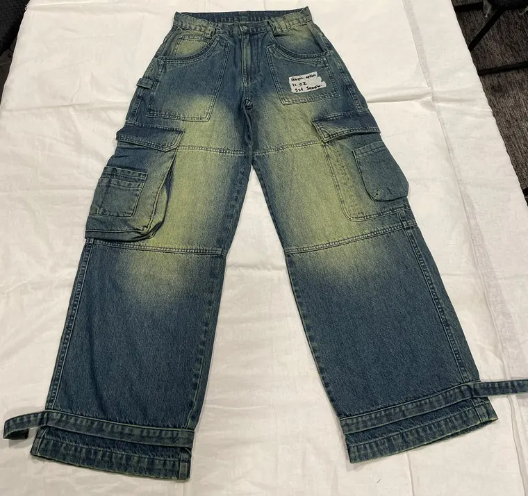
Washed utility cargo jean
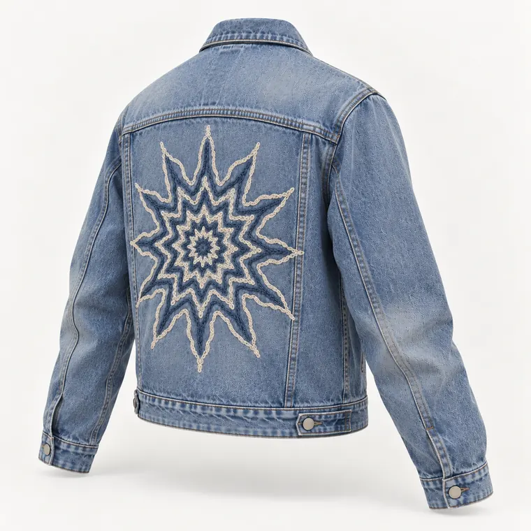
Zip-front denim shirt
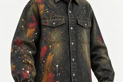
Paint-splatter jean
Key decisions
01
Sell the range, not the samples
The problem
Twelve samples make a thin catalogue, and every new sample costs fabric, time and money before a buyer has said yes.
The decision
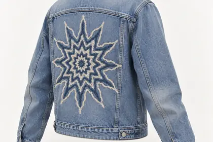
I designed 18 new pieces using only the fabrics, washes and trims already on the factory floor, so every concept is something Texwear can make. Twelve became thirty.
Sample 12 physical samplesD 18 new concepts, same fabrics and trims
02
Nine shots for every piece
The problem
Images made one at a time drift: different light, angles and crops, until the range stops looking like one company.
The decision
Every concept gets the same shot list: a hero, three catalogue angles and five details chosen for what makes that piece different. A code in each file name, like D06_DETAIL_SIGNATURE, keeps all 162 renders in order.
The website needed people in the clothes, and a new face in every shot makes a small brand look stitched together.
The decision
Four models, fixed on one cast sheet, appear in every look. Outfits mix samples with concepts, so buyers see what exists and what could, side by side.
04
Keep samples and concepts apart
The problem
A buyer who orders from an image needs to know whether the piece already exists.
The decision
Samples carry TX codes and concepts carry D codes, from file names to the looks they appear in, and the sales deck marks every sample as physical. Here, one tinted wash runs through a sample and three concepts.
Production buyers care about construction and capability, and a flat product shot shows neither.
The decision
A B2B kit of explainers: an exploded view of the zip shirt that names its collar, pockets, zip and frayed hem, fabric turning into a garment, a rivet up close, and a 10-second film of the cargo jean rising out of its own denim.
The cargo jean rising out of its own denim, 10 seconds
The campaign
What I designed
Range concept: 18 new piecesShot list and file codes162 concept renders111 catalogue imagesWebsite campaignB2B explainer kit10-second film8-page sales deck
Everything except the phone photos was made with AI image and video tools, directed by me and built from Texwear’s own samples, fabrics and trims. The 12 samples are physical; the 18 concepts are designed to be made from what’s already in stock.
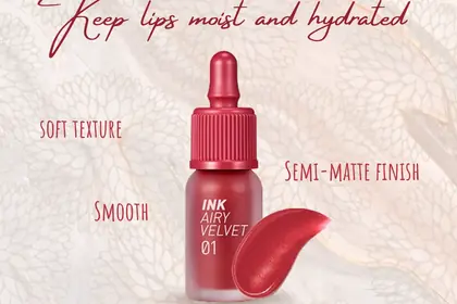
Where I learned to make things move: brands, social posts, product listings and motion for clients, from 2023 to now.
Clients
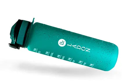
Texwear, Ninety2, Beauteporium, LADON, Ziganoo Studio, about 20 crypto launches
Tools
Illustrator, Photoshop, After Effects, Canva, CapCut, Midjourney
Years
2023 to 2026
Showreel 30 seconds of the work below
Ninety2
Clothing brand, 2023
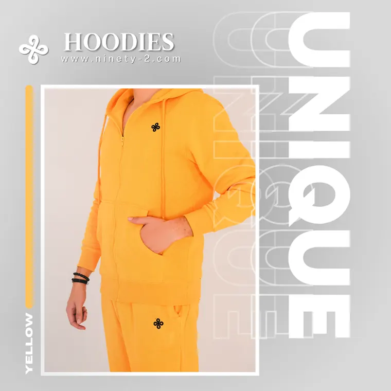
Logo, labels, hang tag, Instagram posts and web covers. Every colourway gets its own one-word headline. The brand’s photographer shot the products; I edited the photos and designed everything around them.
MarkLockupHorizontalOn dark
Clear space x, a quarter of the mark’s width, on every side